
Burn-down graphs (or charts) are most often associated with the Scrum methodology increasingly favoured by many software developers (you can get to grips with it in this 10 minute video). They help you to visualise how you are progressing through your work backlog. Very simply put, it shows how quickly are you getting things done, and how much more there is to do. There is, of course, the obligatory Wikipedia definition of a burn down chart:-
A burn down chart is a graphical representation of work left to do versus time. The outstanding work (or backlog) is often on the vertical axis, with time along the horizontal.
Now, not everyone likes burn down graphs – they do have some very definite limitations. In Milestone Planner, Milestones have a status beyond just completed or open, and as we are tracking an entire project, so we have to deal with things like changes in scope (adding and removing milestones), and down the line, we also want to show the earned-value in the project (see “Earned-value and Burn Charts” by Alistair Cockburn).
Burn-up charts are the mirror image of burn-down charts, and are much better suited for charting the progress of an entire project. As the name implies, they are line an upside down version of a burn-down graph. Being the other way up let’s them display different types of status, and any changes in scope show up as changes on the top line. If you are interested, you can get more of an idea about how they compare by reading David Anderson’s “Managing with Cumulative Flow Diagrams“, or see how burn-up charts can be used to show bottlenecks in Juurgen Appelo’s take.
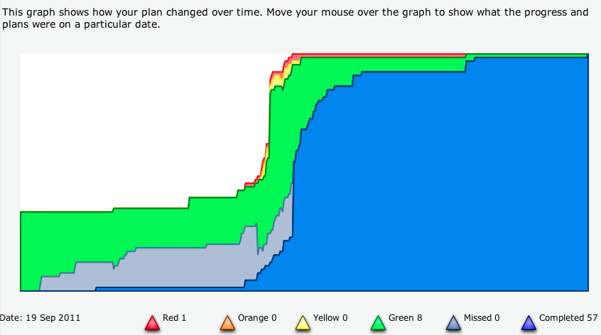
A picture is worth a thousand words, so here is an example of a burn-up graph from Milestone Planner (we call it a progress graph – didn’t wan’t to get the health and safety folk all hot under the collar with talk of fires):
But the image is only part of the picture, as it were (not doing so well with metaphors today). From left to right, we can see how the project suddenly grows in scope (number of milestones) half way through, and we can see a steady difference between work completed, in blue, and the target completion, shown as ‘missed’ in light blue. But because we track the full history of the plan, we can also show how these estimates have changed over the course of the project. Watch this video from Jim to see what we mean:
Slightly mind bending stuff, but we hope, after a little explanation, that it makes sense. As ever, the best way is to dive in and try it for yourself. You’ll need to run your project for a few weeks to really see how the progress graph works. We hope that it gives you a better view of how your project is going, and helps you stay on track!